Lya
Lya
Headquartered in the vibrant city of London, United Kingdom, Lya emerges as a distinguished purveyor of premium beauty and skincare. Distinctively devoted to the exceptional efficacy of pure, cold-pressed, organic oils for both skin and hair, Lya entrusts us with the task of crafting an unrivaled brand identity in preparation for their highly anticipated launch. Our paramount objective? To create a brand that epitomizes the unparalleled quality of its offerings, empowering Lya to compete fiercely with the foremost luxury beauty and skincare brands across the United Kingdom and the globe.
Not content with mere adherence to organic purity, Lya aspires to transcend boundaries and explore a diverse range of products, encompassing both purely organic and organic-based formulations as they forge ahead on their remarkable journey.
With plans to debut on renowned online UK retailers and in select brick-and-mortar establishments, Lya recognized the utmost significance of alluring brand identity and captivating packaging. These pivotal elements would propel them to stand out amidst a sea of competitors and secure resounding success.
Embracing the profound potential of branding as a powerful storytelling tool, we embarked on an intensive research and insight-gathering phase. Delving deep into the world of Lya, we scrutinized its competitors and meticulously examined its target audience. Armed with invaluable knowledge, we began formulating a core concept that would encapsulate the narrative we sought to convey.
In our unwavering pursuit of Lya's triumph, we recognized the fundamental need to craft a story that emanates from the very essence of the brand. A story that resonates with their customers, instilling a sense of trust, allure, and unwavering loyalty. Through meticulous attention to detail and an unwavering commitment to excellence, we strived to weave a captivating tapestry that would elevate Lya above and beyond the competition, captivating the hearts and minds of beauty enthusiasts worldwide.
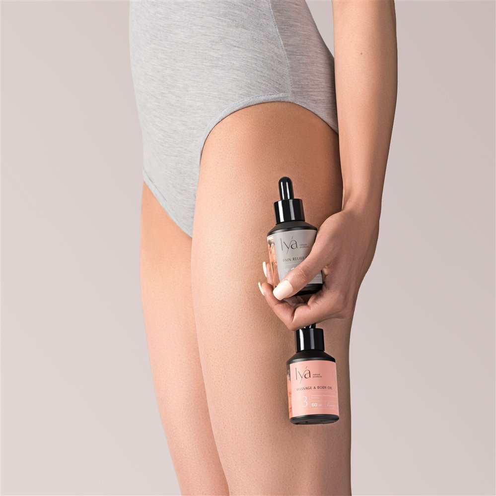
Lya’s story had to evoke the senses. The experience of touching the oil and feeling its smoothness on your fingertips, the luxurious texture of the oil smelling of nature’s most profound treasures, the feeling of relaxation and tranquility that overpowers you as you begin taking care of your body and mind by giving it what it deserves: a gift from nature, the luxury of nature.
In addition to a touch of nature, Lya brought a sense of antiquity, inspired by the ancient nature of the practice of oil extraction and also the fact that Lya was a family business inheriting its roots from generations before.
For us, Lya was a careful, elegant manifestation of history and nature, a romantic lyrical engagement with the world around us and the world within us, a world of senses that was bottled up and brought to the audience in today’s hectic and modern world. We decided that Lya could stand apart from its competitors across all touchpoints by capturing this.
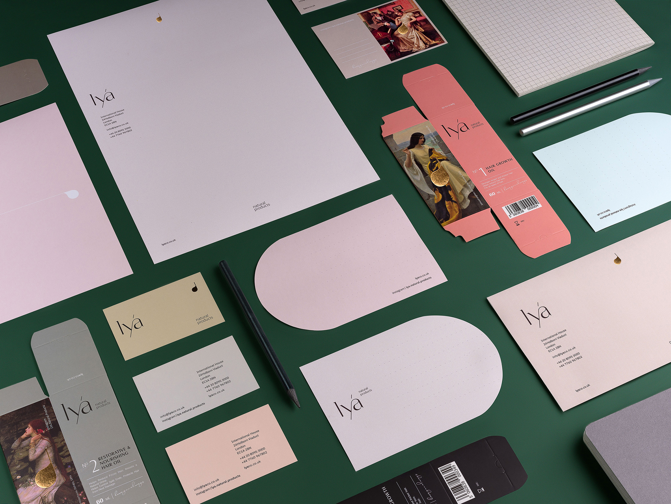
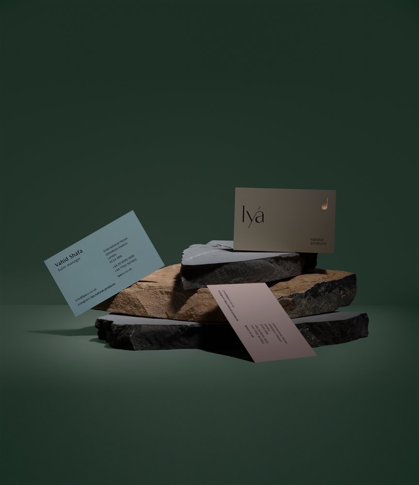
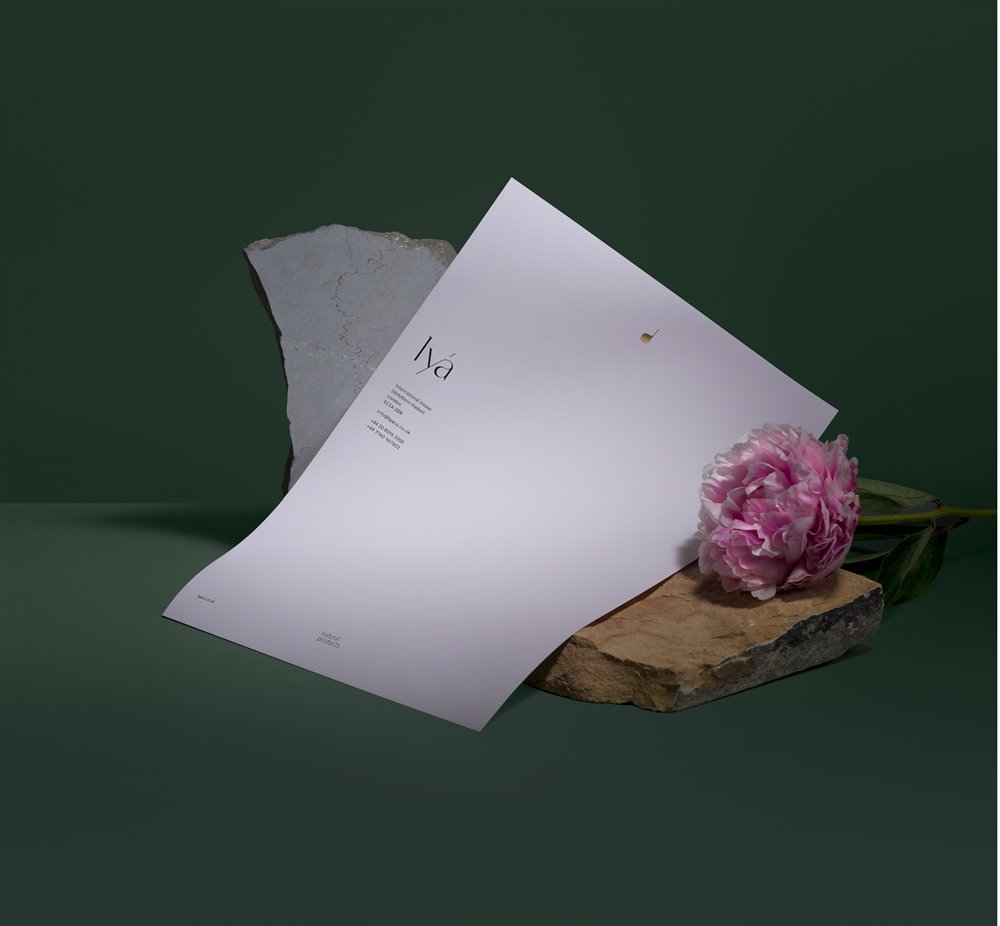
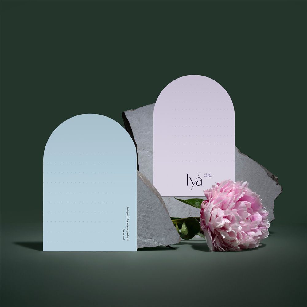
Brand identity is a story told visually. We were inspired by the concept of nature’s lyricism, as well as the sensuous oil drops that encapsulated nature and history at once.
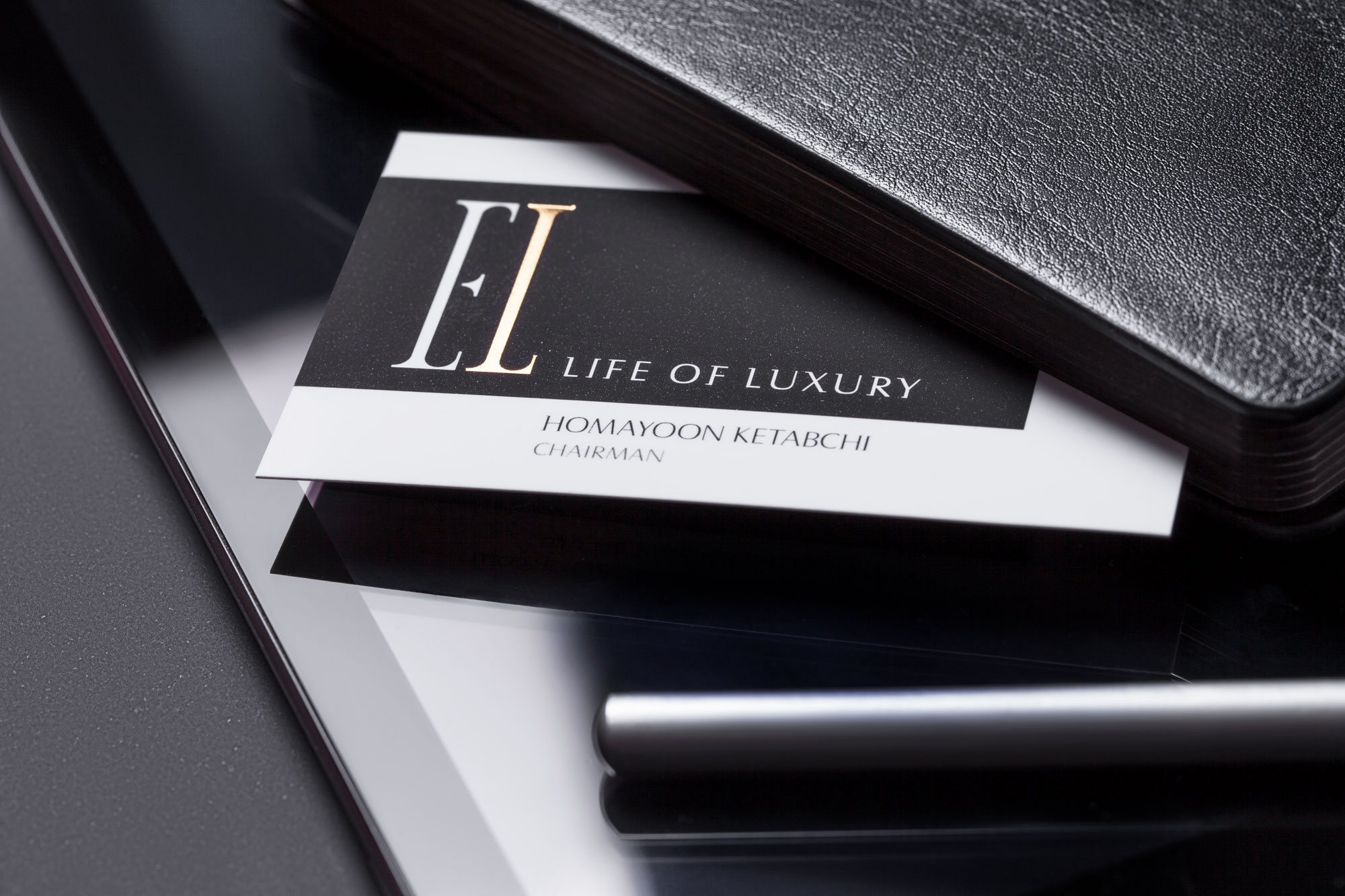
Merging these ideas together, we arrived at our brand mark, resembling almost a cross between a musical note and a drop. The thin delicate aesthetic of the brand mark conveyed romanticism and modern luxury at once. The same feeling was captured in the logotype, written all in letter case to also convey a sense of friendliness and create intimacy with our audience. The letter “a” in the logotype was designed to resemble the brand mark. An accent mark, a diacritic acute, was added to create pause, and provide an extra moment for the brand’s inherent charm and professionalism to convenience the eye of the viewer.
Also in chemistry, when a branch is added to an element it changes its properties. On par with our brief, this would allow the brand to one day diverge from its pure organic nature to include other formulations while maintaining an organic basis.
The extended height of the letters created a sense of luxury and stylishness. The strapline “natural products” was designed to be dynamic in terms of placement, allowing the brand to be fashionable and lively while operating within a set design system across different platforms.
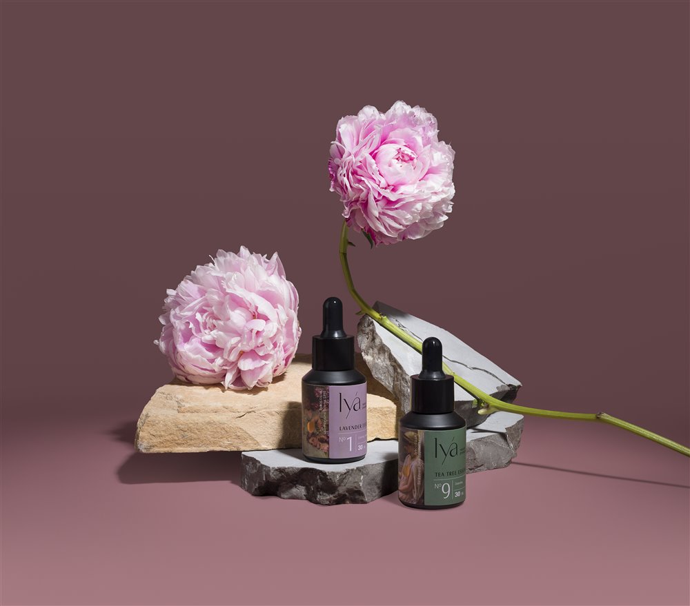
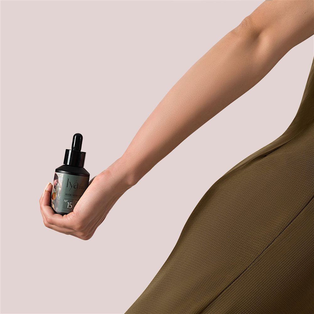
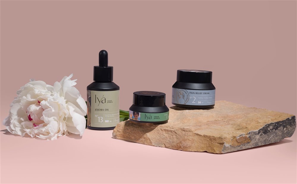
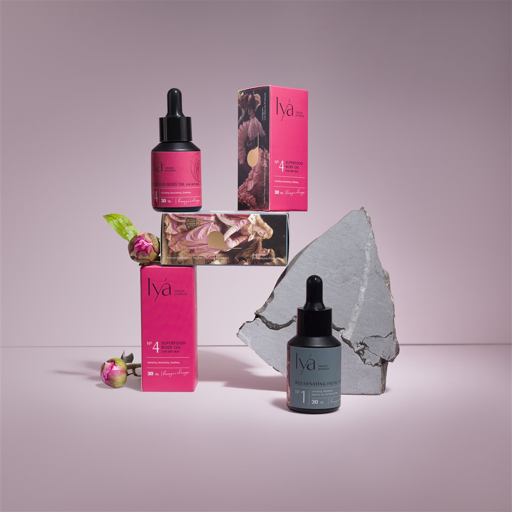
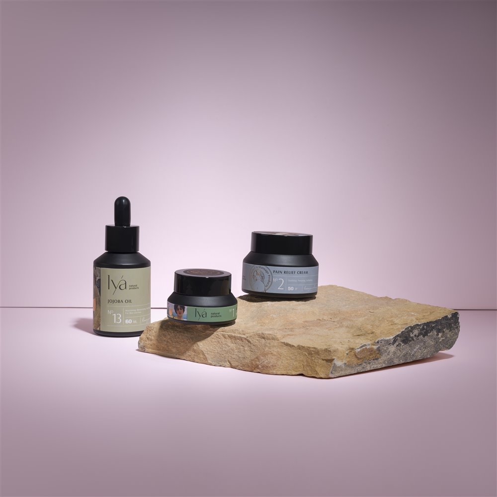
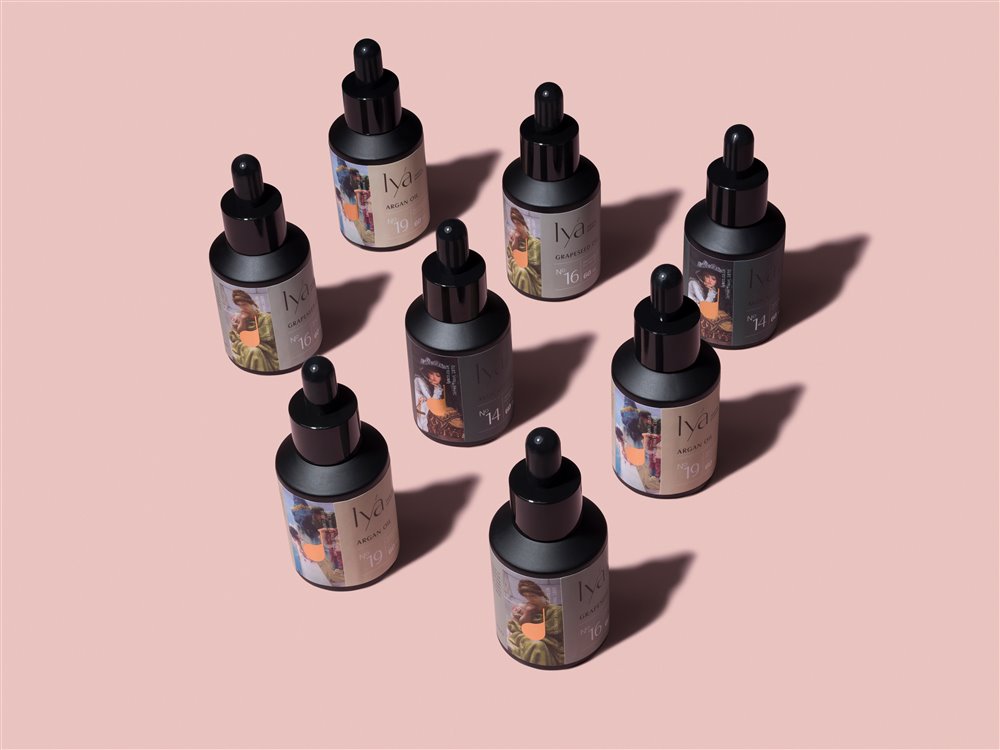
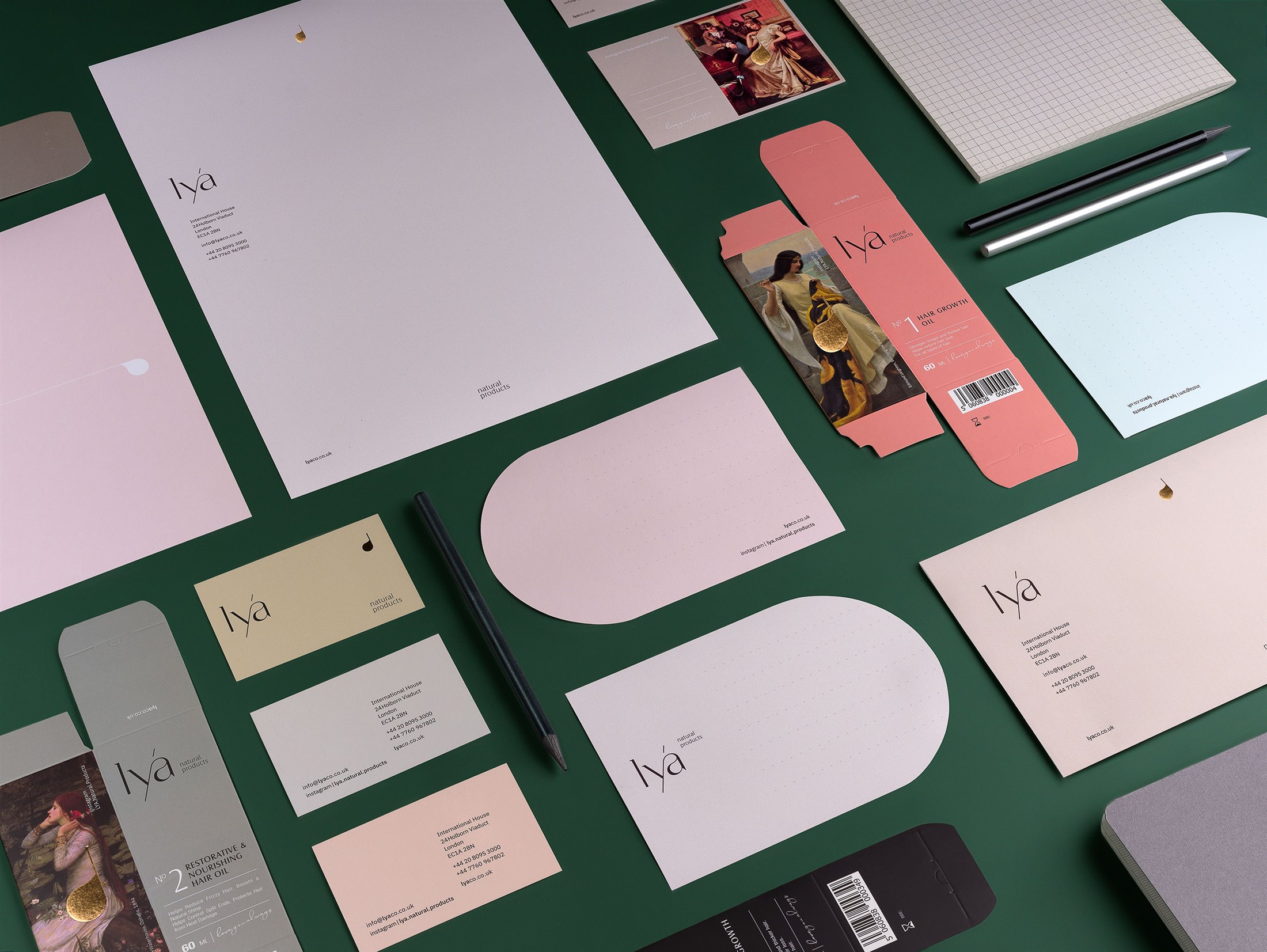
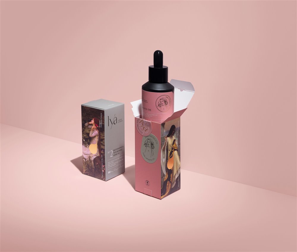
The packaging embodied sensations of nostalgia and elegance, a touch from an era when life was slower and savored. This was reflected in the design of the tabled layout for the labels and the numbers marking each product. The dark black color of the glass bottles resembled old medicine bottles and communicated quality and seriousness with a touch of nostalgia. We also included classical paintings, which had been crucial to our concept development up to this point, to further reinforce these ideas.
We designed illustrations to be used as signage, which were later printed in gold engraving and placed on the packaging to indicate different product lines such as hair care, pain relief, and others.
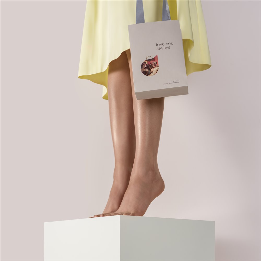
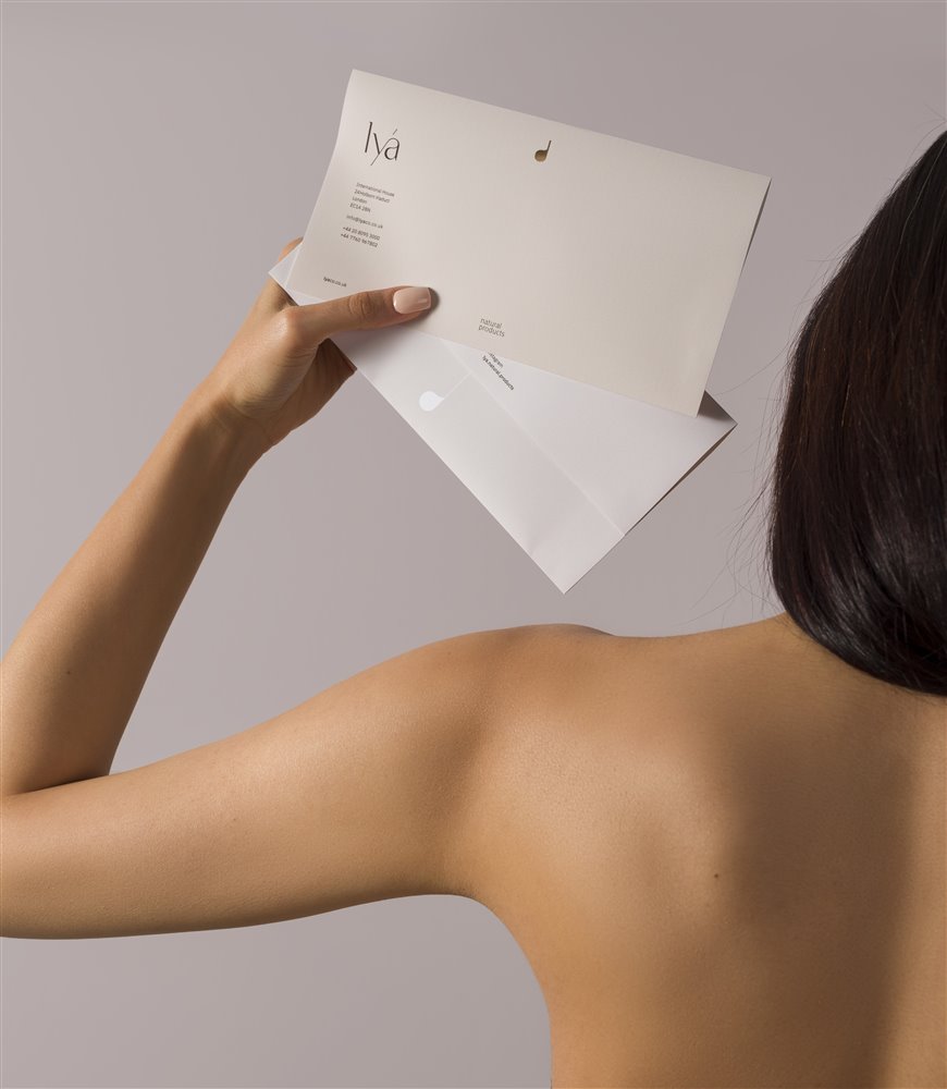
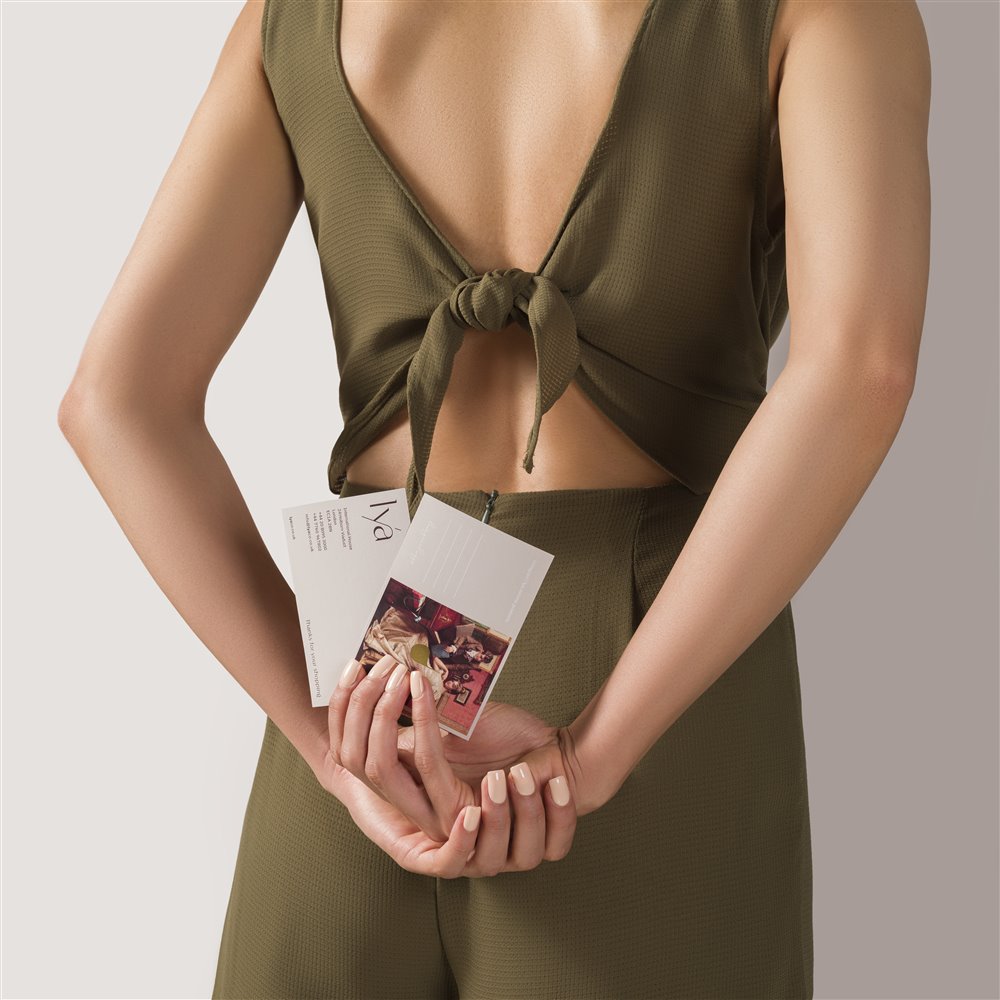
Brand assets and communication materials including stationary, packaging and wrapping accessories were developed based on the brand identity. We also designed Lya’s website, generated its visual strategy for social media and directed its photo shoots and video production to convey the same aesthetic of modern elegance inspired by history and nature across touch points.